CASE STUDY: ANIWA
Aniwa Logo and Brand Identity Case Study: A Letter Born from a Prophecy
How we designed the logo, poster, and color identity that gave a global alliance of Indigenous elders a brand mark built from the Eagle and Condor prophecy at its center.
CORE INSIGHT: The Story Is The Symbol

THE CHALLENGE
Aniwa is something rare. A global alliance founded in 2015 when a group of Indigenous elders came together to share teachings on how to weave the sacred into everyday life. Built on the Condor and Eagle prophecy preserved by Inka and Qanchis ancestors, the organization brings together respected Indigenous leaders from around the world, gathers seekers across global retreats and annual ceremonies, and serves as a portal between ancient knowledge systems and contemporary life.
The founders came to us with the mission, the elders, and the prophecy. They needed a visual identity that could carry the weight of what they were holding, and a simple, scalable logo they could carry into their first digital products.
The brand problem was unusual, and the failure modes were sharper than most categories. Identity work for organizations affiliated with Indigenous traditions tends to fall into one of two traps. Full decoration leans on generic imagery, flattens distinct lineages into a single aesthetic, and risks appropriation. Full minimalism strips out cultural meaning entirely and leaves a clean wordmark that fails to honor what the organization actually stands for. Aniwa needed neither. It needed a mark that encoded its specific cosmology in a form that could also function as an app icon, a favicon, a poster, and the visual signature of a global movement.
THE STRATEGIC INSIGHT
A brand mark that carries sacred meaning has to do two jobs at the same time. It has to encode the cosmology so insiders recognize the story. And it has to function as modern UI so the digital product can launch with it tomorrow.
Most identities in this space pick one. Aniwa could not afford to.
The Condor and Eagle prophecy is not background lore. It is the organizational thesis. Two great birds, one from the North and one from the South, reuniting after centuries of separation to bring their knowledge systems back into balance. Every retreat, every gathering, every elder council Aniwa convenes is a living enactment of that prophecy. The logo could not gesture vaguely at Indigenous wisdom. It had to encode the specific story the organization was built to fulfill.
The strategic move was to make the letterform itself carry the prophecy. Not a wordmark with the prophecy beside it. Not a symbol pinned next to the name. The letter A, the first letter of the brand, formed by the silhouettes of an eagle and a condor meeting in flight, becoming one shape.
When a viewer sees the mark for the first time, they see a letter A. When they see it again, they see the two birds. When they understand the prophecy, they see the entire foundation of the organization compressed into a single character. The mark grows in meaning as the viewer's understanding grows. The story is the letter.
For the color system, we anchored the identity in a deep purple primary that signals sacred meaning without locking the brand into the visual language of any single tradition. From that anchor we expanded into a full rainbow spectrum across the brand's supporting palette, signaling what Aniwa actually is: an alliance of many peoples, many lineages, many colors of light, brought together into one circle.
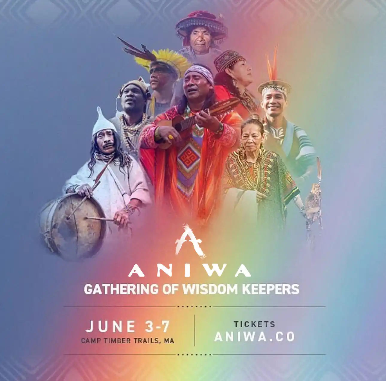
THE SOLUTION
We designed the Aniwa identity around the prophecy at its core.
The logo is a stylized letter A formed by an eagle and a condor coming together in flight. The two birds, North and South, meet at the apex of the letterform. Their wings extend to form the diagonals. The negative space tells the story. The story is the letter.
We built the mark to work at every scale the alliance would need it to work at. As a poster at a global gathering. As a favicon on a phone screen. As an icon on a digital portal where seekers enter to study with elders. As the visual signature on retreat materials, ceremonial print pieces, and the marketplace where Indigenous artisans sell their work. Simple enough for the smallest screen. Specific enough that no other organization in the world could carry it.
We extended the color identity from the deep purple primary into a rainbow spectrum that has carried across every channel of the alliance since. The poster we designed established the early visual vocabulary that the rest of Aniwa's expression would grow from.
We then handed the identity to Aniwa, who has used it as the foundation for everything the alliance has grown into since.
THE OUTCOME
Aniwa took the brand identity we built and grew it into one of the most expansive Indigenous led organizations in the contemporary spiritual space.
A logo Aniwa still uses. The eagle and condor A monogram designed at the start remains the visual signature of the organization across every channel and every initiative. The clearest measure of a logo's quality is whether it survives the organization outgrowing the agency that made it.
A color system that has scaled across an entire ecosystem. The deep purple and rainbow palette we established still anchors Aniwa's identity across its digital portal, retreat programs, annual gathering, nonprofit arm, marketplace, and global communications.
A visual foundation that has carried Aniwa through years of expansion. What started as a logo, poster, and color identity now anchors an ecosystem spanning the digital portal, the annual Aniwa Gathering with fifty elders, global retreats with Indigenous communities, the Huya Aniwa nonprofit for land and tradition protection, an Indigenous artisan marketplace, and 1:1 elder readings.
A community at scale. Active presence across Instagram, Facebook, TikTok, and YouTube, with a growing membership now entering the Aniwa portal for ongoing teachings, ceremonies, and elder guidance.
A mark that earned the trust of Indigenous elders. The harder and less visible outcome, and the one that matters most for this kind of work. A global alliance of elders from unbroken lineages chose to carry the mark we made as the visual face of work they hold sacred. That is the credential.
The Condor and Eagle prophecy speaks of a meeting that took centuries to arrive. A logo that carries that meaning has to work the same way. Ready when the viewer is. Growing in meaning as they learn the story.
"Rahul gave Aniwa a mark that carries the prophecy at the heart of our work. The eagle and condor coming together as a single letter is not decoration. It is the story we are here to fulfill, made visible. Years later, it is still the face of everything we do."
- Vivien Vilela, Cofounder & President, Aniwa
MORE PROOF
Clarity builds trust and creates momentum
Every project is built to solve a business problem. We help companies become more recognizable, more trusted, and more valuable in the eyes of their customers. We help founders transform scattered ideas into cohesive brands that feel credible, premium, and emotionally aligned.