The Story Is The Symbol
Most logos are labels.
The best logos are containers.
They hold meaning. They compress stories. They reveal more of themselves as understanding grows.
A weak logo identifies a company.
A strong logo teaches you something about it.
That’s the difference.
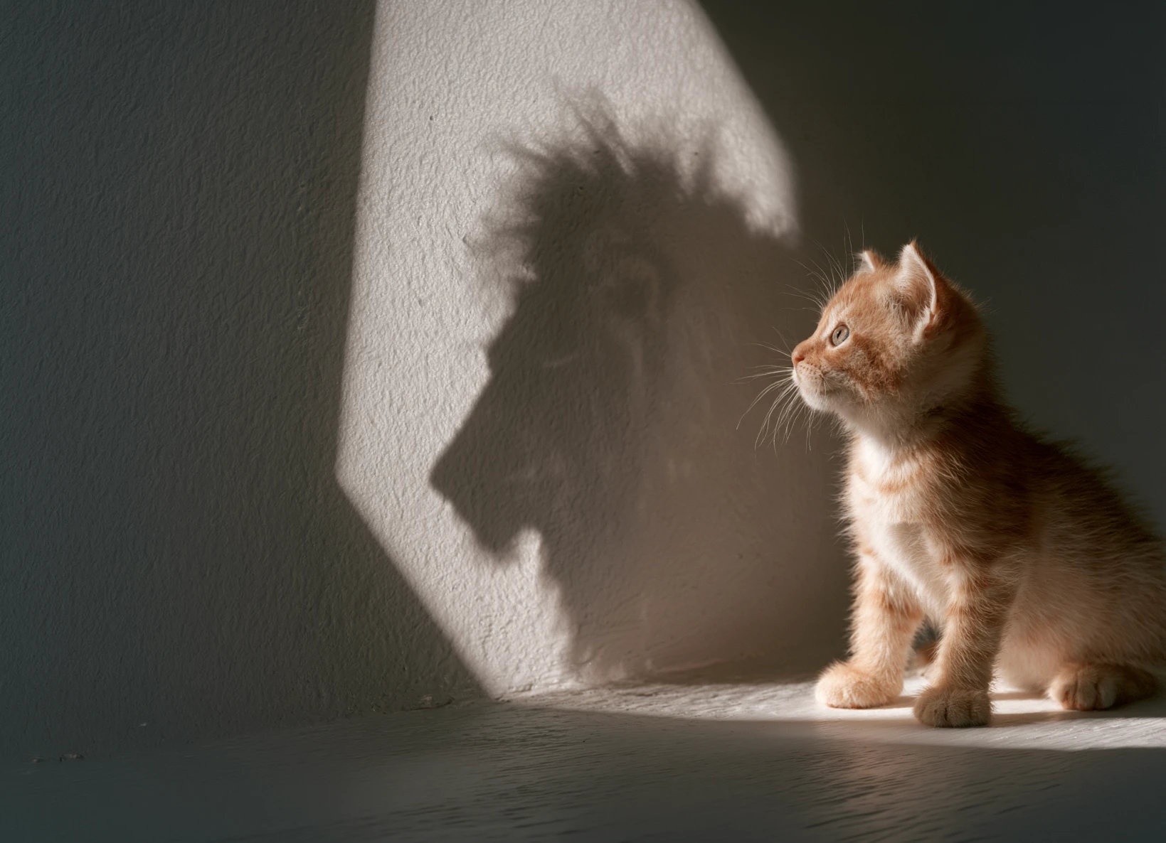
Emojis Are Modern Hieroglyphics
One day it clicked for me that emojis are the modern version of hieroglyphics.
Human beings are wired to understand symbols.
The Christian cross.
The Jewish star.
National flags.
Sports team logos.
The Nike swoosh.
The Apple logo.
They’re all doing the same thing.
They are symbols that carry meaning far beyond their physical form.
Even our alphabet started this way. Many ancient written languages began as pictures and symbols before evolving into abstract characters. Chinese and Japanese characters still preserve much of that visual lineage.
That’s when I stopped thinking about logos as graphics.
A logo wasn’t just a shape anymore.
It was an emoji.
A compressed idea.
A symbol capable of carrying an entire worldview.
And once I saw that, I could never unsee it.
The Tattoo Test
My first funded startup was a company called Prometheus Springs.
The brand developed a cult following.
One day a guy working at Whole Foods told me he thought the logo would make a cool tattoo.
Most brands give away hats.
Most brands give away t-shirts.
I offered to pay for the tattoo.
Then I printed flyers and offered the same deal to other stockers carrying our product.
Instead of handing out branded merchandise, we gave away tattoos.
Completely ridiculous.
Completely wonderful.
And it taught me something I have never forgotten.
People don’t tattoo products.
People tattoo identities.
Nobody permanently marks their body because they like a beverage.
They do it because the symbol represents something about who they are.
That realization changed how I viewed branding forever.
A logo isn’t just identification.
At its highest level, it’s identity technology.
The Difference Between A Graphic And A Symbol
Most logos are graphics.
The best logos are symbols.
A graphic is decoration.
A symbol carries meaning.
A graphic gets noticed.
A symbol gets remembered.
A graphic identifies.
A symbol unites.
That’s why some marks disappear the moment a trend changes while others survive for generations.
The symbol isn’t valuable because it’s beautiful.
It’s valuable because it means something.
Meaning compounds.
Beauty ages.
The Best Symbols Resolve A Tension
One of my favorite examples is a brand I created for Michael Holt.
Michael teaches meditation and martial arts.
Most men’s brands choose a side.
Peace or power.
Compassion or strength.
Presence or aggression.
Michael’s philosophy was different.
He believed healthy masculinity required both.
The savage and the saint.
The warrior and the monk.
The logo became two peaceful swans that simultaneously formed a snarling tiger.
The swans represented grace.
The tiger represented power.
The viewer discovers that the swans themselves create the tiger.
The symbol teaches the philosophy.
Without reading a word.
That’s strategic compression in visual form.
The best logos don’t illustrate a company.
They resolve the central tension of the company.
The Product Became The Symbol
The same thing happened with Pure Stack.
Most managed IT companies sell expertise.
Faraz sold something different.
He replaced an entire company’s infrastructure stack with new equipment and then maintained it for a predictable monthly fee.
The business model was the differentiator.
So the name became Pure Stack.
Then the logo became a literal technology stack.
The visual structure itself communicated the offering.
The symbol wasn’t decoration.
The symbol was the product.
That’s the goal.
Not to create something clever.
To create something true.
The Story Hidden Inside The Symbol
Another example is Aniwa.
Aniwa is built around the Condor and Eagle Prophecy.
The prophecy describes two great birds from the North and South reuniting after centuries apart.
Most designers would have created a logo and then explained the story beside it.
We put the story inside the logo.
The mark became the letter A formed by an eagle and a condor meeting in flight.
The first time you see it, it’s an A.
The second time you see two birds.
The third time you understand the prophecy.
The fourth time you understand the mission.
The story is the symbol.
The Pepsi Problem
This is why so many logo redesigns fail.
The problem usually isn’t execution.
It’s meaning.
Take the recent Pepsi redesign.
Designers argued about whether it looked better or worse.
I think that’s the wrong conversation.
The real question is:
What does it mean?
What truth does it encode?
What story does it carry?
What belief does it reinforce?
If the answer is nothing, then you’ve created a graphic.
Not a symbol.
A logo doesn’t need to be beautiful.
It needs to be meaningful.
The One Question Every Founder Should Answer
Before you hire a designer.
Before you open Illustrator.
Before you choose colors.
Before you sketch a single concept.
Answer this question:
What is the one thing you want people to know?
That’s it.
That’s the entire game.
Nike answered it with a swoosh.
Movement.
Momentum.
Motion.
Done.
The best logos are not illustrations.
They are compressed truths.
The shortest possible answer to the most important thing your business stands for.
The Symbol Is The Story
Most founders start with aesthetics.
They ask:
“How should it look?”
The better question is:
“What should it mean?”
Because when you discover the answer, the logo often becomes obvious.
The strongest symbols don’t get their power from design.
They get their power from truth.
A symbol should become more meaningful as understanding grows.
It should reward attention.
It should unfold over time.
And if you get it right, something remarkable happens.
People don’t just recognize it.
They wear it.
They share it.
Sometimes they tattoo it on their body.
That’s when you know you’ve created something bigger than a logo.
You’ve created a symbol.
Related Principles
What Is Strategic Compression?
If your logo disappeared tomorrow, would your customers lose anything besides recognition?
Most companies have a logo.
Very few have a symbol.
If you’re trying to figure out what your business actually stands for—and how to compress that truth into a name, message, and identity—start with a Brand Clarity Audit.